
Product
Tuesday, December 30, 2025
Making Your Project Come Alive with Design

Introduction
When we think about building software, it’s easy to get bogged down in the logic—the APIs, the data processing, and the infrastructure. But a project truly "comes alive" when it moves from being a functional tool to an engaging experience. For our recent project DMP-Chef, we focused on making the interface feel engaging yet intuitive. We wanted users to feel the power of the tool without being overwhelmed by its complexity. Here’s a look behind the curtain at the design choices and tools we used to breathe life into the platform. We hope that these can be useful to you as well.
1. Motion with Meaning: LottieFiles
Static icons are great, but motion tells a story. We integrated LottieFiles to handle micro-interactions. Lotties are JSON-based animations that are tiny in file size but offer high-quality, scalable motion.
Whether it's a subtle pulse to show a process is running or a celebratory checkmark upon completion, these animations guide the user's eye and provide instant feedback. It makes the platform feel responsive and "awake."
A Simple LottieFiles Implementation (Vue):
<script setup>
import { DotLottieVue } from '@lottiefiles/dotlottie-vue'
</script>

<template>
  <DotLottieVue
    style="height: 200px; width: 200px"
    autoplay
    loop
    src="https://lottie.host/your-animation-id/scene.json"
  />
</template>
2. Depth and Hierarchy: Gradient Effects
Flat design can sometimes feel "cold." To make our UI more inviting, we utilized layered gradients and blur effects.
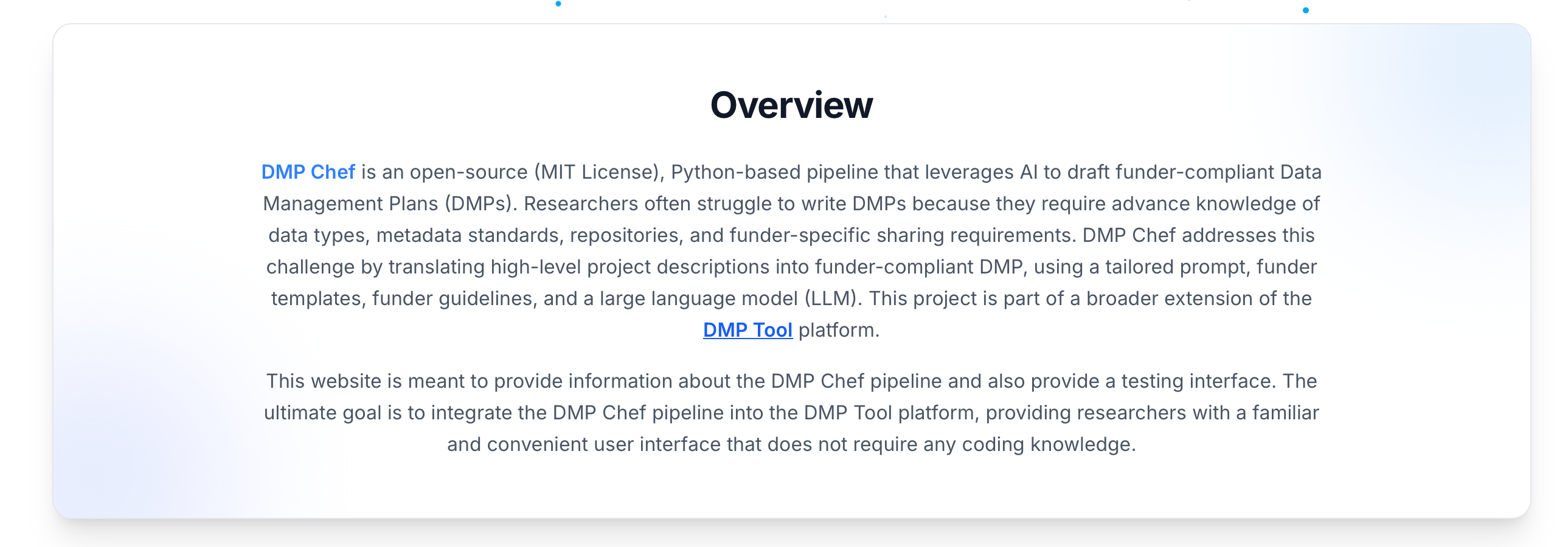
In our card components and headers, we didn't just use solid borders. We used background gradients and "glow" spots (radial gradients) behind the content. This creates a sense of depth—as if the cards are floating on a soft bed of light.
The "Glow" Technique
Using blur and low-opacity colors in the background (like soft blues or indigos) helps separate sections without using harsh lines.

Gradient Borders
A subtle transition from a light grey to a transparent shade makes the cards feel premium and modern.
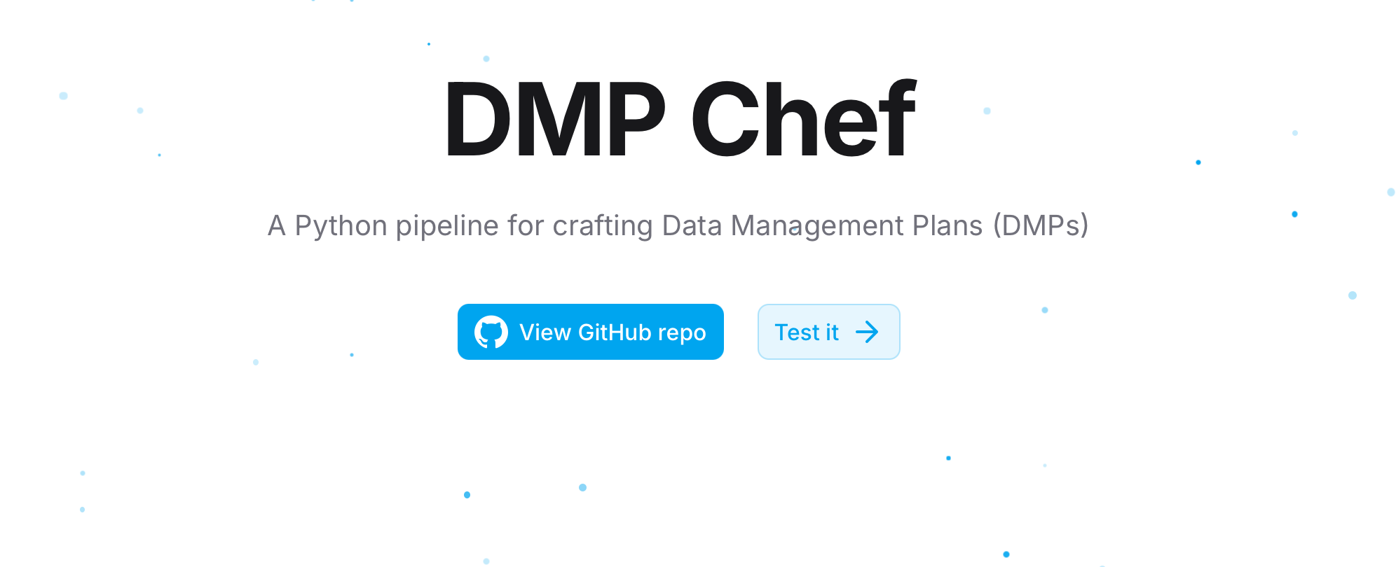
3. Creating Atmosphere: The Particle System
To give a section a sense of scale and "life," we implemented a particle system.
Instead of a static image, we have subtle, floating elements that react to the page. This serves a psychological purpose: it signals to the user that the platform is dynamic and modern. The key is subtlety—the movement should be "background noise" that adds character, not a distraction that pulls focus away from the main Call to Action (CTA).
Final Thoughts
Design is not merely about aesthetics; it is about how a system functions for the people who use it. By combining high-performance animations such as LottieFiles, subtle visual depth through gradients, and the atmospheric presence of a particle system, we have created an experience that feels as advanced as the logic operating beneath the surface. We hope these approaches prove equally valuable and adaptable in your own projects.
Acknowledgements
Some portions of this post were refined with the assistance of ChatGPT’s writing tools.