
Guide
Wednesday, October 15, 2025
Building a Performant File Explorer in the Browser with React

Why build your own File Explorer?
Existing file explorer libraries such as react-file-tree, react-sortable-tree, or Chonky often fall short when it comes to flexibility, especially with large datasets or complex hierarchical structures. Adapting them to fit a specific data model can quickly become more work than building a custom solution, especially if you need advanced features like virtualization, custom icons, or intricate folder and file state management. I experienced this firsthand while developing a custom file explorer for SODA for SPARC, which helps researchers prepare and share standardized data on the NIH-supported sparc.science repository. This guide provides the essential knowledge and code examples to help get you on your way to building a great file explorer!
Libraries Used in the Tutorial
This guide uses the libraries listed below. These are the ones we use, but you can swap them out with alternatives of your choice depending on the stack you are currently using or what you are comfortable with:
Deciding on a Data Model for Your File Explorer
Before writing any UI code, it's a good idea to determine the data structure you will use to render your file structure. In many cases, your data source will be hierarchical, such as a nested folder tree (for example, JSON). However, most browser virtualization libraries operate on arrays, so you will often need to maintain a flattened version of your data for efficient rendering.
Below is an example of a function that takes in a nested file tree and converts it to an array of objects, each containing the information needed to render a file or folder in the UI, including its depth, parent folder, and expanded state.
// Example hierarchical file structure
const fileTree = {
  id: 'root',
  name: 'Root',
  type: 'folder',
  children: [
    {
      id: '1',
      name: 'Documents',
      type: 'folder',
      children: [
        { id: '2', name: 'data.xlsx', type: 'file' },
        { id: '3', name: 'code_file.py', type: 'file' },
        {
          id: '4',
          name: 'Projects',
          type: 'folder',
          children: [{ id: '5', name: 'Proposal.odt', type: 'file' }],
        },
      ],
    },
    {
      id: '6',
      name: 'Photos',
      type: 'folder',
      children: [{ id: '7', name: 'puppy.png', type: 'file' }],
    },
  ],
};

// Recursive function to flatten a nested file tree
function flattenFileTree(node, depth = 0, parentId = null) {
  const { children = [], ...rest } = node;

  // Create the current node with extra properties for UI
  const flatArray = [
    {
      ...rest,
      depth, // Depth for indentation in the UI
      parentId, // Reference to parent folder
      expanded: false, // Track whether the folder is expanded
    },
  ];

  // Recursively process children
  children.forEach((child) => {
    flatArray.push(...flattenFileTree(child, depth + 1, node.id));
  });

  return flatArray;
}

// Flatten the tree for virtualization
const flattenedFiles = flattenFileTree(fileTree);

// The resulting data structure:
[
  {
    id: 'root',
    name: 'Root',
    type: 'folder',
    depth: 0,
    parentId: null,
    expanded: false,
  },
  {
    id: '1',
    name: 'Documents',
    type: 'folder',
    depth: 1,
    parentId: 'root',
    expanded: false,
  },
  {
    id: '2',
    name: 'data.xlsx',
    type: 'file',
    depth: 2,
    parentId: '1',
    expanded: false,
  },
  {
    id: '3',
    name: 'code_file.py',
    type: 'file',
    depth: 2,
    parentId: '1',
    expanded: false,
  },
  {
    id: '4',
    name: 'Projects',
    type: 'folder',
    depth: 2,
    parentId: '1',
    expanded: false,
  },
  {
    id: '5',
    name: 'Proposal.odt',
    type: 'file',
    depth: 3,
    parentId: '4',
    expanded: false,
  },
  {
    id: '6',
    name: 'Photos',
    type: 'folder',
    depth: 1,
    parentId: 'root',
    expanded: false,
  },
  {
    id: '7',
    name: 'puppy.png',
    type: 'file',
    depth: 2,
    parentId: '6',
    expanded: false,
  },
];
Creating a Basic File Explorer UI
Now that you have a flattened data model, you can start building a simple file explorer interface. The interface we will be building is designed to be compact, easy to navigate, and minimize the number of rendered elements to maintain performance even with large datasets.
For the first step, we can create basic FolderItem and FileItem components that display the name of each item and calculate indentation based on the depth property from our flattened array. This lays the foundation for rendering the file hierarchy before adding more advanced features.
import React from 'react';

// FolderItem component
export const FolderItem = ({ name, depth }) => {
  const indent = depth * 16; // 16px per level of depth
  return <div style={{ paddingLeft: `${indent}px` }}>📁 {name}</div>;
};

// FileItem component
export const FileItem = ({ name, depth }) => {
  const indent = depth * 16; // 16px per level of depth
  return <div style={{ paddingLeft: `${indent}px` }}>📄 {name}</div>;
};

// FileExplorer component
const FileExplorer = ({ items }) => {
  // Helper to determine if an item should be visible (reduces elements rendered into the DOM which can cause browser crashes)
  const isVisible = (item, allItems) => {
    if (!item.parentId) return true; // Root-level items are always visible

    // Find the parent item
    const parent = allItems.find((i) => i.id === item.parentId);

    // If the parent is expanded, recursively check its parent
    return parent?.expanded && isVisible(parent, allItems);
  };

  return (
    <div>
      {items
        .filter((item) => isVisible(item, items)) // Only render items inside expanded folders
        .map((item) =>
          item.type === 'folder' ? (
            <FolderItem key={item.id} name={item.name} depth={item.depth} />
          ) : (
            <FileItem key={item.id} name={item.name} depth={item.depth} />
          ),
        )}
    </div>
  );
};

// Example usage with the flattened array from Step 1
<FileExplorer items={flattenedFiles} />;
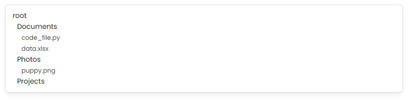
The code above will render a basic looking file explorer like the one below:
Enhancing the User Interface
We can make the file explorer more intuitive by adding Tabler Icons for folder and file icons. Folders show open or closed icons depending on their expanded state, while files display icons that correspond to their file type, such as code files or images.
Adding icons not only makes the explorer visually appealing but also improves usability, helping users quickly distinguish between folders and different types of files.
Below is an example of how to integrate Tabler Icons into our FolderItem and FileItem components.
import React from 'react';
import {
  IconFolder,
  IconFolderOpened,
  IconFile,
  IconFileText,
  IconFileCode,
  IconFileImage,
  IconFilePdf,
} from '@tabler/icons-react';

// Utility to get the file icon based on extension
const getFileIcon = (fileName) => {
  const ext = fileName.split('.').pop().toLowerCase();

  switch (ext) {
    case 'pdf':
      return <IconFilePdf size={18} />;
    case 'md':
      return <IconFileText size={18} />;
    case 'py':
      return <IconFileCode size={18} />;
    case 'png':
      return <IconFileImage size={18} />;
    default:
      return <IconFile size={18} />;
  }
};

// FolderItem with click handler
export const FolderItem = ({ name, depth, expanded, onClick }) => {
  const indent = depth * 16;

  return (
    <div
      style={{
        paddingLeft: `${indent}px`,
        display: 'flex',
        alignItems: 'center',
        cursor: 'pointer',
      }}
      onClick={onClick}
    >
      {expanded ? <IconFolderOpened size={18} /> : <IconFolder size={18} />}
      <span style={{ marginLeft: 8 }}>{name}</span>
    </div>
  );
};

// FileItem with click handler
export const FileItem = ({ name, depth, onClick }) => {
  const indent = depth * 16;
  const icon = getFileIcon(name);

  return (
    <div
      style={{
        paddingLeft: `${indent}px`,
        display: 'flex',
        alignItems: 'center',
        cursor: 'pointer',
      }}
      onClick={onClick}
    >
      {icon}
      <span style={{ marginLeft: 8 }}>{name}</span>
    </div>
  );
};

// FileExplorer component
const FileExplorer = ({ items, onFolderClick, onFileClick }) => {
  // Only render items inside expanded folders
  const isVisible = (item, allItems) => {
    if (!item.parentId) return true;
    const parent = allItems.find((i) => i.id === item.parentId);
    return parent?.expanded && isVisible(parent, allItems);
  };

  return (
    <div>
      {items
        .filter((item) => isVisible(item, items))
        .map((item) =>
          item.type === 'folder' ? (
            <FolderItem
              key={item.id}
              name={item.name}
              depth={item.depth}
              expanded={item.expanded}
              onClick={() => onFolderClick?.(item)}
            />
          ) : (
            <FileItem
              key={item.id}
              name={item.name}
              depth={item.depth}
              onClick={() => onFileClick?.(item)}
            />
          ),
        )}
    </div>
  );
};

// Example usage:
<FileExplorer
  items={flattenedFiles}
  onFolderClick={(folder) =>
    console.log(
      'Folder clicked (You can add your custom folder click logic here such as toggling the expanded state of your folder):',
      folder,
    )
  }
  onFileClick={(file) =>
    console.log(
      'File clicked: (You can add your custom folder click logic here such as selecting the file)',
      file,
    )
  }
/>;
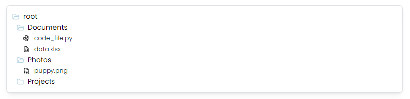
The code above will render a styled file explorer with icons like the one below:
Adding Virtualization to Handle a Large Amount of Folders and Files
When your application needs to display hundreds or even thousands of files, rendering all of them in the DOM at once can drastically slow down the performance of your file explorer. TanStack Virtual solves this by rendering only the items currently visible in the viewport (plus a small buffer that you can tweak depending on the needs of your UI), which means you might only be rendering 40–60 items at a time even if your explorer contains thousands of folders and files.
Below is a simple example of how to use TanStack Virtual to virtualize your file explorer.
import React, { useRef } from 'react';
import { useVirtualizer } from '@tanstack/react-virtual';
import { FolderItem, FileItem } from './FileExplorerComponents'; // Import folder and file components to keep this example shorter/

// Virtualized File Explorer
export const VirtualizedFileExplorer = ({
  items,
  onFolderClick,
  onFileClick,
}) => {
  const parentRef = useRef(null);

  // Determine if an item should be visible based on folder expansion
  const isVisible = (item, allItems) => {
    if (!item.parentId) return true;
    const parent = allItems.find((i) => i.id === item.parentId);
    return parent?.expanded && isVisible(parent, allItems);
  };

  // Only include visible items — helps reduce unnecessary virtualization overhead
  const visibleItems = items.filter((item) => isVisible(item, items));

  // Initialize TanStack Virtual
  const rowVirtualizer = useVirtualizer({
    count: visibleItems.length, // Total number of visible rows
    getScrollElement: () => parentRef.current, // The scroll container
    estimateSize: () => 28, // Each row is ~28px tall (from earlier FolderItem/FileItem examples)
    overscan: 10, // Render a few extra items above and below for smooth scrolling
  });

  return (
    <div
      ref={parentRef}
      style={{
        height: '400px', // Fixed scroll area height for the example
        overflow: 'auto', // Enable scrolling
        border: '1px solid #ddd',
      }}
    >
      {/* This inner div mimics the full height of all items combined */}
      <div
        style={{
          height: rowVirtualizer.getTotalSize(),
          position: 'relative',
        }}
      >
        {/* Only the visible subset of items are rendered here */}
        {rowVirtualizer.getVirtualItems().map((virtualRow) => {
          const item = visibleItems[virtualRow.index];

          return (
            <div
              key={item.id}
              style={{
                position: 'absolute',
                top: 0,
                left: 0,
                width: '100%',
                transform: `translateY(${virtualRow.start}px)`,
                height: 28, // Matches estimateSize for optimal virtualization performance
                display: 'flex',
                alignItems: 'center',
              }}
            >
              {item.type === 'folder' ? (
                <FolderItem
                  name={item.name}
                  depth={item.depth}
                  expanded={item.expanded}
                  onClick={() => onFolderClick?.(item)}
                />
              ) : (
                <FileItem
                  name={item.name}
                  depth={item.depth}
                  onClick={() => onFileClick?.(item)}
                />
              )}
            </div>
          );
        })}
      </div>
    </div>
  );
};

// Example usage
<VirtualizedFileExplorer
  items={flattenedFiles}
  onFolderClick={(folder) =>
    console.log('Folder clicked (toggle expanded state here):', folder)
  }
  onFileClick={(file) =>
    console.log('File clicked (select file or open preview):', file)
  }
/>;
Conclusion
Building your own file explorer in the browser can seem like a big task, but breaking it down into smaller pieces and iterating along the way makes it much more manageable. With this guide as your starting point, you can establish a solid foundation: defining your data model, creating simple UI components, and adding virtualization. Next, you can make it your own by enhancing the styling, adding context menus, and whatever else your heart (or project scope) requires!